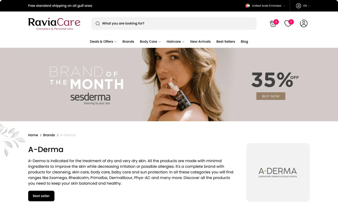
Brand page
A brand page that opens with a campaign banner, then a short brand story and a logo card, so shoppers learn who they are buying from.
- Brand-of-the-month campaign banner
- Short brand story
- Logo card for quick recognition

Case study
A full-cycle design engagement, from user research to final UI, for desktop and mobile in English with Arabic localisation support.
Overview
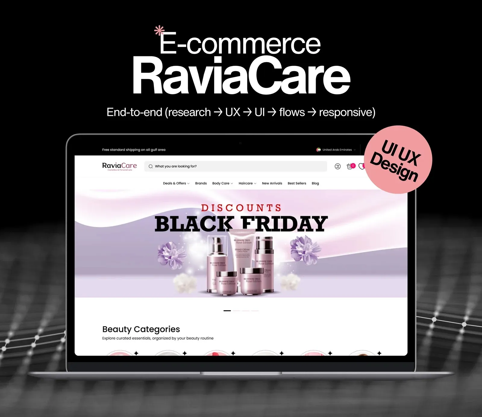
RaviaCare is a beauty and personal care e-commerce platform designed for the Gulf, with a focus on the United Arab Emirates. It connects customers with skincare, haircare, body care and fragrance from trusted international brands such as Vichy, La Roche-Posay, Eucerin and CeraVe.
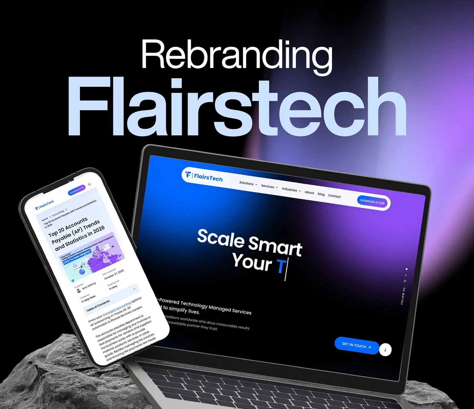
The brief called for a full-cycle engagement, from user research through final UI, covering desktop and mobile in English with Arabic localisation support.
About the client
What it covers
The challenge
Products are sold across many channels, rarely with consistent information, trust signals or a seamless purchase journey.
Users struggled to find products for their skin type.
Little confidence in delivery timelines and return policies, which feeds cart abandonment.
Reach an English and Arabic audience without a mirrored template.
Workflow
I take the brief from the client, then read it closely: goals, audience, constraints and what success looks like. Nothing is drawn until the requirement is clear.
I start on paper: quick sketches of structure and key flows, so ideas are cheap to change before any pixel is placed.
I set the foundations: colour, type, spacing and core components. If the client already has a design system I build on it, otherwise I create one for the project.
With the system in place I assemble the screens from its components, so every page stays consistent and fast to build.
The process
Secondary research, competitive analysis, a research plan and a screener survey.
Six remote user interviews over video call.
Affinity diagram, empathy map and a primary persona.
Information architecture and low-fidelity wireframes for desktop and mobile.
Colour, type, spacing and components, then high-fidelity desktop and mobile screens.
The work
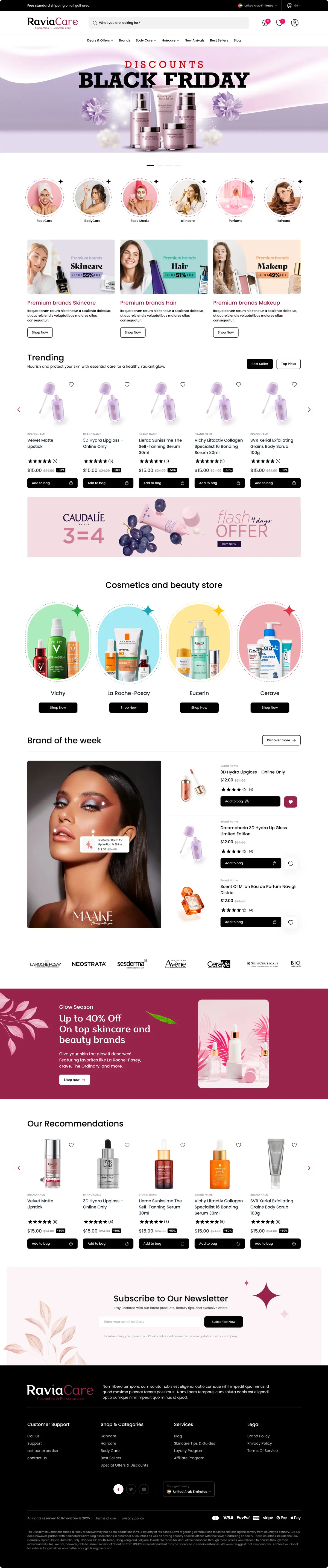
Hover to scroll the page
Selected screens
A brand page that opens with a campaign banner, then a short brand story and a logo card, so shoppers learn who they are buying from.
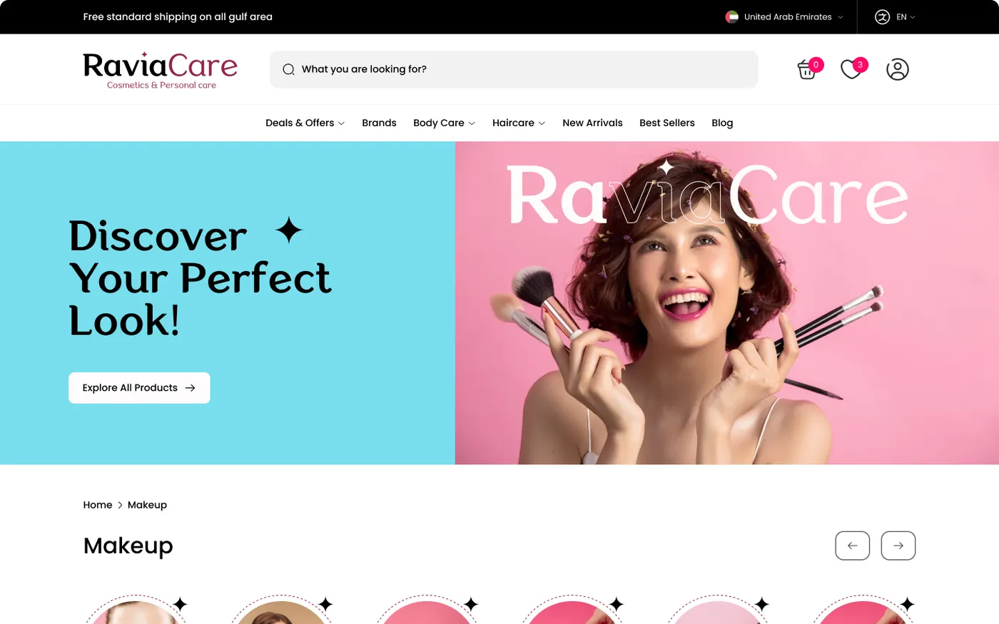
The category page leads with a bright campaign hero, then circular sub-categories for quick browsing.
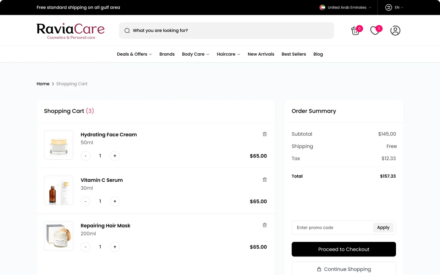
A cart that keeps the order summary beside the items, with a promo-code field and one clear route to checkout.
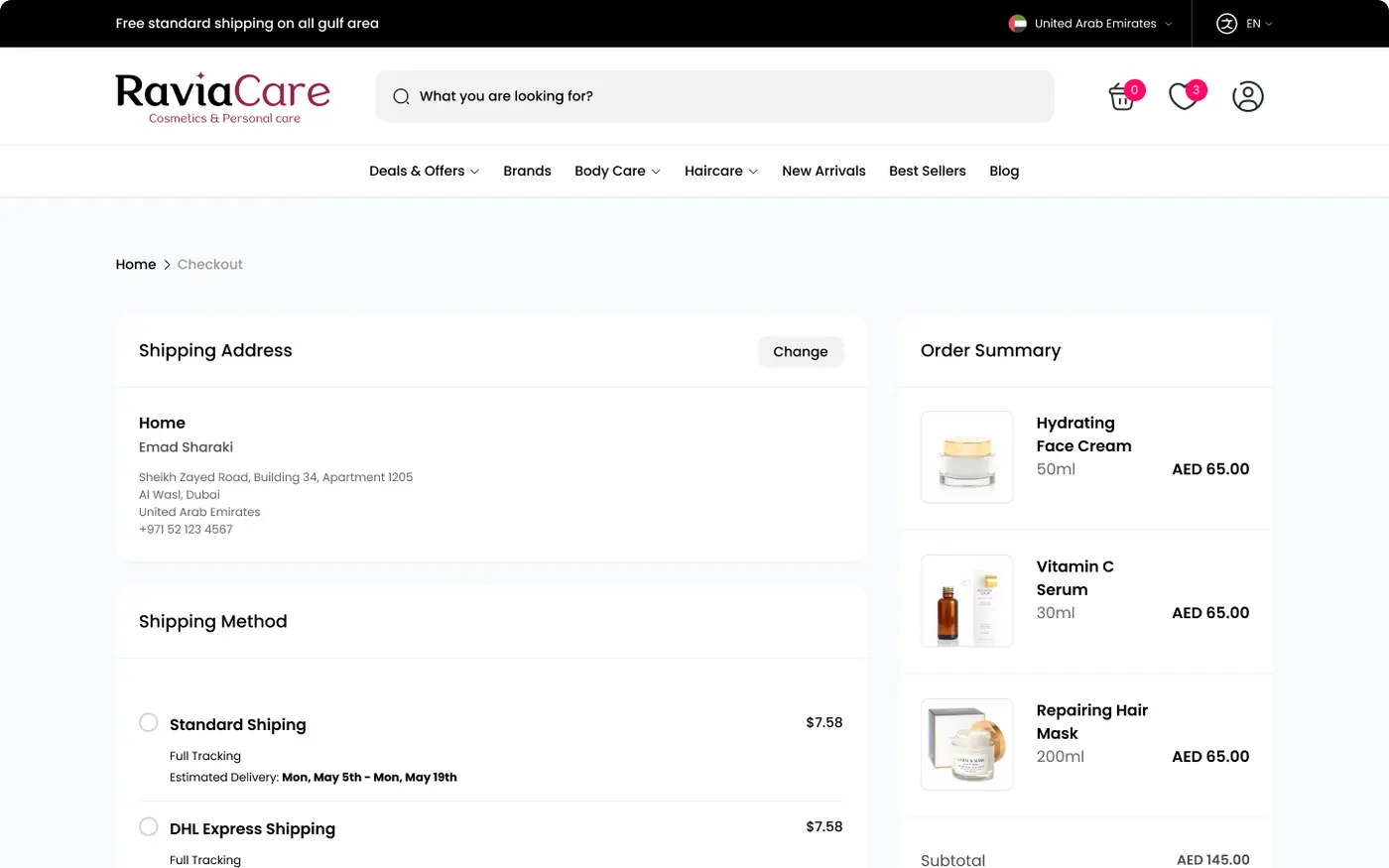
Checkout stacks the shipping address and delivery method on one side and keeps the summary on the other, which is where delivery transparency pays off.
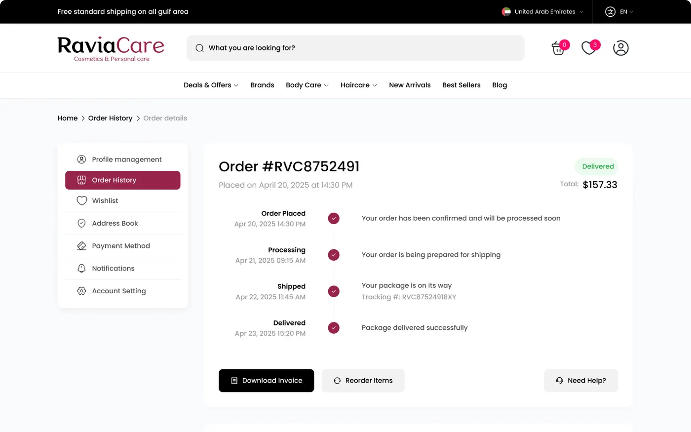
An order page that tells the story of the delivery as a four-step timeline, with invoice, reorder and help actions underneath.
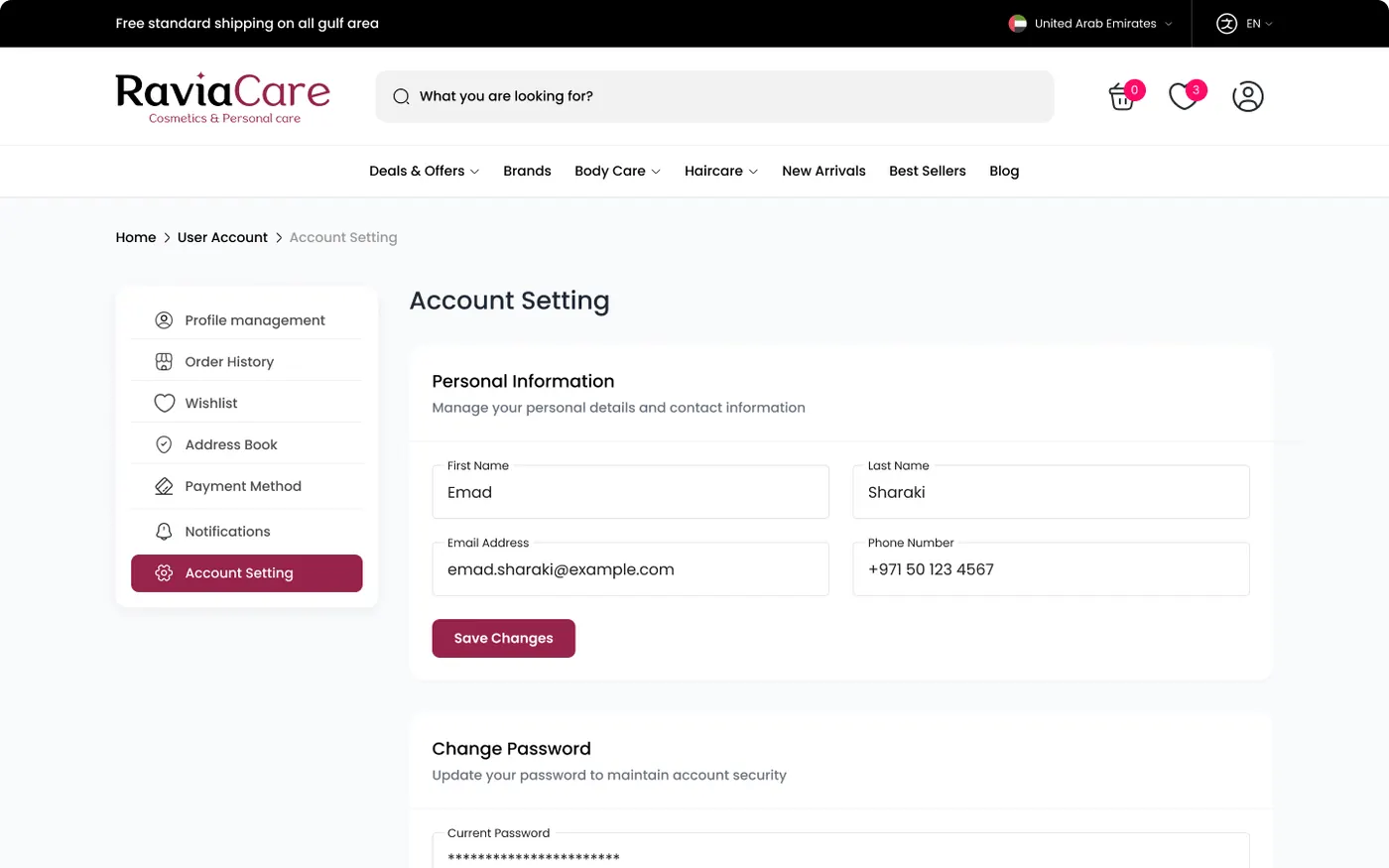
A calm settings screen: a side menu for every account area and a single form for personal information with a save action.
Design decisions
A dedicated screen makes logistics transparent, answering the delivery and returns doubt directly.
Glow Season, New Arrivals and Brand Showcase blocks bring promotion into the layout without noise.
Content hierarchy per section helps shoppers find what suits their skin.
Layouts were considered for switching between English and Arabic from the start.
The brand
What I delivered