Sign in
A split sign-in: a calm, minimal form on one side and a photograph of the Kaaba on the other, all in the platform's gold.
- Username or email, plus password
- One gold primary button
- Register link for new pilgrims
Case study
A unified digital gateway for pilgrims and service providers to plan, book and experience the journey of Umrah, from visa eligibility to full itinerary management.
Overview
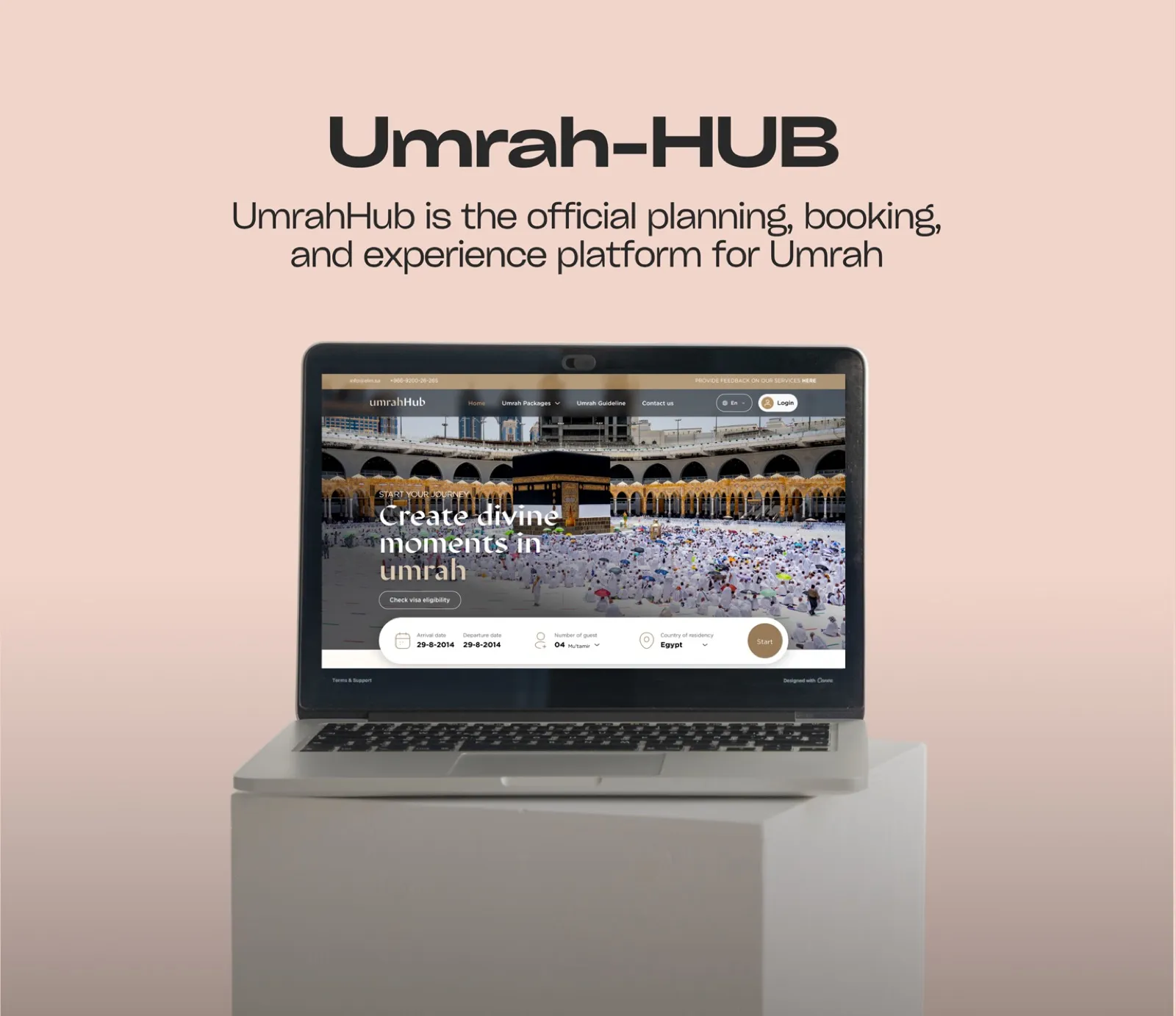
UmrahHub is the official planning, booking and experience platform for Umrah, the Islamic pilgrimage to Makkah and Madinah. It serves two groups: pilgrims planning their journey, and licensed service providers offering packages, flights and tourism experiences.
The design challenge was a dignified, trustworthy experience that reflects the spiritual significance of Umrah while staying simple enough for a global, multilingual audience, many of whom are not digitally native.
What it covers
The challenge
Dozens of countries and languages with very different digital literacy, on one platform.
Balance licensing, visa eligibility and service contracts with a simple booking flow.
Make Arabic and English work seamlessly across a wide layout without losing reading hierarchy in either.
Separate live services (Umrah permit, attractions) from upcoming ones (flights) without hurting trust.
Speak to pilgrims and to business operators at the same time.
Workflow
I take the brief from the client, then read it closely: goals, audience, constraints and what success looks like. Nothing is drawn until the requirement is clear.
I start on paper: quick sketches of structure and key flows, so ideas are cheap to change before any pixel is placed.
I set the foundations: colour, type, spacing and core components. If the client already has a design system I build on it, otherwise I create one for the project.
With the system in place I assemble the screens from its components, so every page stays consistent and fast to build.
The process
Pilgrims, providers and the regulatory frame.
Sign in, OTP, package choice, pilgrim details, payment, reservation.
An editorial gold-and-grey system, written down.
Desktop screens in Arabic and English.
Tokens and component rules for the build team.
The work
Hover to scroll the page
Selected screens
A split sign-in: a calm, minimal form on one side and a photograph of the Kaaba on the other, all in the platform's gold.
The OTP step keeps one task on screen: enter the code that was sent, with the timer and the resend option close by.
The same step in its in-progress state, with digits entered and the confirm action ready.
Booking starts with a three-step progress bar, the chosen package and a running purchase summary, so pilgrims always know what they are paying for.
Step two collects each pilgrim's details in a list, marking entries as saved and verified as they are completed.
A package page with the price up front, tabs for hotels, transportation and description, and an action to download the itinerary.
Design decisions
Warm, metallic golds against a spectrum of architectural greys: a gallery, not a template.
Sections are separated by tonal shifts between surfaces instead of 1px borders.
Noto Serif for headlines and Manrope for interface text, with generous line height.
Floating navigation at 80% surface with a 24px blur lets gold tones bleed through.
A white card on a slightly darker surface lifts without visual clutter.
Live and upcoming services are clearly distinguished, so trust is never spent on a promise.
The brand
What I delivered