Book a consultation
A closing call-to-action block that puts people at the centre: team portraits surround one clear promise and a single button.
- One message, one action
- Human faces build trust
- Soft background keeps the button the loudest element

Case study
A full-scale marketing and service website for a global technology managed services provider, from the homepage and service pages to the blog, careers and a custom AI product.
Overview
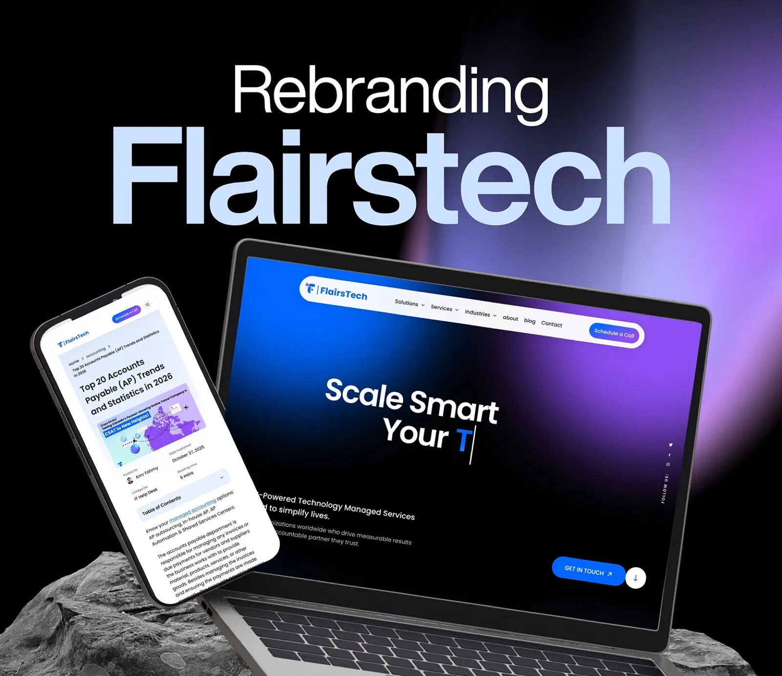
FlairsTech is a technology-driven managed services provider delivering end-to-end solutions, from application maintenance and technical support to digital transformation and custom software.
They needed a website that communicated enterprise credibility while staying approachable. The project covered the full website, built as a cohesive system with shared components and a consistent design language.
About the client
What it covers
The challenge
Show enterprise credibility while staying approachable for buyers of all sizes.
Keep a single design language across homepage, services, about, blog, careers, contact and a product page.
Give the AI product AIMY its own presence without breaking the FlairsTech identity.
Speak to the US, GCC, Egypt and Poland without the copy feeling generic.
Workflow
I take the brief from the client, then read it closely: goals, audience, constraints and what success looks like. Nothing is drawn until the requirement is clear.
I start on paper: quick sketches of structure and key flows, so ideas are cheap to change before any pixel is placed.
I set the foundations: colour, type, spacing and core components. If the client already has a design system I build on it, otherwise I create one for the project.
With the system in place I assemble the screens from its components, so every page stays consistent and fast to build.
The process
Understand the audience and the "simplify lives" positioning.
Sitemap for seven page types, navigation and mega-menu variants.
Colour, type and a shared component library.
Homepage, services, about, blog, careers, contact and AIMY.
Front-end ready files and a system the team can extend.
The work
Hover to scroll the page
Selected screens
A closing call-to-action block that puts people at the centre: team portraits surround one clear promise and a single button.
The services landing page opens with a team photograph under a blue overlay, then moves straight into scannable service rows.
Careers reuses the same page hero and speaks to people first: a bold headline paired with a short culture statement and team photography.
A focused contact form with reassurance beside it: client logos sit under the headline so the form feels safe to send.
The article template keeps long reading calm: a clear title, author and date block, share tools and a feature banner that links the post back to client work.
A winding timeline explains the engagement in four steps, so a complex service reads as a simple path.
Design decisions
The page opens dark and transitions to white, communicating the journey from complexity to clarity and matching the "simplify lives" positioning.
Electric blue (#2563EB) is used only for CTAs, links and active states, creating a clear hierarchy and a trust signal common to enterprise tech.
Key performance numbers (98% CSAT, 97% SLA) sit on the service page hero, turning compliance data into a conversion tool.
A dotted world map with location pins scales globally while the copy stays regionally specific (US, GCC, Egypt, Poland).
The AI gets its own section on the homepage and a dedicated page, with its own visual identity inside the brand.
A shared nav (Solutions, Services, Industries, About, Blog, Contact) and a "Schedule a Call" CTA repeat on every page, with mega-menu variants.
The brand
What I delivered